With its built-in image scaling, Prague can be a great choice for displaying your images large on big monitors while scaling down the images to fit a smaller laptop monitor. Prague also features site-wide audio capability (after the initial splash page comes up).
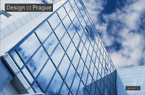
For this sample design example, we've inserted a series of large (1920 x 1200 pixel) images for the home page - one of the images comes up randomly each time you reach the home page. This kind of entry page can be done for any of our layouts - just contact us if you want to use this kind of home page design.
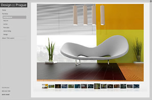
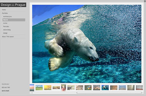
The inside images are scaled to be a maximum of 1400 pixels wide and 934 pixels deep - large enough to fill up most large monitors within the design of the layout. The images will auto-scale on both flash slide shows and regular HTML layouts.
With the auto-expanding left navigational menu, your site will be easy-to-use and maximize the vertical space for your site. You can use site-wide audio with Prague as well - the music will start playing after entering the site from the home entry page.
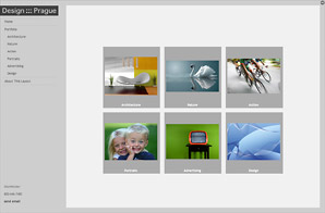
In this example, we are using the "Rokkitt" font for the navigational, header and text display. The homepage text logo is set at 40px, the inside pages text logo at 30px, and the text and navigational links display at 18px.